A speculative concept using Enpal's real subscription model as a frame: how should a solar app earn daily trust when customers pay monthly for an outcome they don't own?


Concept screens. Not based on Enpal's actual UI.
Screens explored
Enpal customers couldn't verify their savings, couldn't tell if their system was underperforming, and couldn't trust the numbers the app showed them.
This isn't a data display problem. It's a trust problem — and trust is exactly what Enpal's subscription model runs on.
Six design solutions spanning financial clarity, performance confidence, proactive alerts, forecasting, notifications, and multilingual support for pan-European expansion.
01 · Context
Solar adoption is accelerating across Europe, driven by rising energy prices, REPowerEU policy targets, and falling panel costs. But accessibility created a new problem.
Enpal offers solar PV, battery storage, EV chargers, and an energy monitoring app, on a subscription model. Customers don't own the panels. Enpal does. That shifts the relationship: customers are paying monthly for a promised outcome, not a purchased asset.
A subscription customer who trusts the system stays, upgrades, and refers. A customer who suspects underperformance cancels and churns. Trust isn't a UX nice-to-have — it's directly tied to Enpal's upsell and retention performance.
2x
Solar energy production across Europe since 2019
600 GW
EU solar target by 2030 under REPowerEU
€20k+
Typical homeowner investment in a PV system
02 · Research
Since this is a speculative project without access to Enpal's customers, the research is secondary — but it's grounded in representative German survey data and peer-reviewed studies, not just app reviews. Three customer reviews illustrate the patterns in the data; they don't carry the argument alone.
Synthesized from a representative survey of 4,000+ German homeowners (Initiative Klimaneutrales Deutschland, 2025), peer-reviewed German PV-household research (Wittenberg & Matthies, 2016), and a 482-respondent survey of solar owners used as cross-market corroboration (Enact, 2022 — US, not German). Three App Store reviews add real owner voices. No primary interviews were conducted.
Roughly two-thirds of German homeowners have or plan to install solar by 2029, and Germany added a record 17.5 GW of PV in 2024. The audience is no longer tech enthusiasts — it's ordinary homeowners with moderate technical comfort who want reassurance, not raw telemetry.
German owners are driven by a mix of energy independence (sharpened by recent energy-price anxiety), environmental values, and cost savings — with the emphasis shifting by income and system size. No single motive dominates cleanly enough to claim a strict order; affordability stays significant, since cost is the main reason non-adopters opt out.
Independence-motivated owners want proof they rely less on the grid; environmentally-motivated owners want proof the system is working; savings-motivated owners want euros. All three reduce to the same daily question — is this thing delivering what I was promised? — and euros are the one metric legible to all of them. The category convention answers in kilowatts, which confirms none of these.
These patterns show up in owners' own words. Three reviews, each surfacing a different face of the same trust gap.
The app is showing feed-in tariffs of around €100 per day, even though 0 kWh were fed into the grid. How is that possible? Why can't the user enter their feed-in tariffs and simply multiply by the amount fed into the grid to get the correct amount?
App Store review · 5 users marked helpful
There are daily connection drops, and sometimes the Q2 fuse has to be reset several times a day to restart the Enpal box. Absolutely unacceptable. The app does what it's supposed to, when it actually works.
App Store review · 12 users marked helpful
I constantly have to switch to "today," and it doesn't show me what the individual modules are generating or what the storage level has been over the last hour. And what's the "Enpal Life" button for? I can see my products there, but I can't click on them.
App Store review · 13 users marked helpful
The user this concept is for
Research-based proto-persona · synthesized from secondary data, not interviews
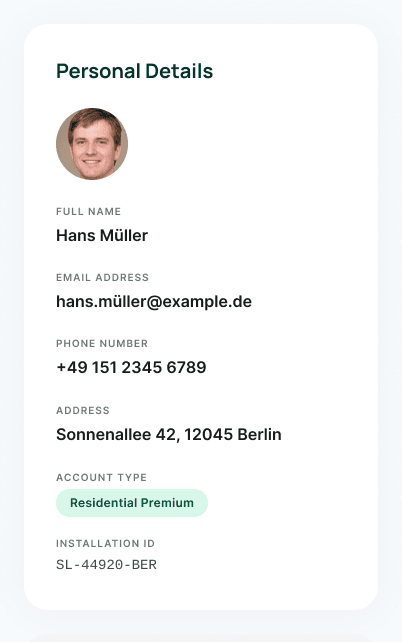
Hans Müller, 52
Homeowner, Berlin. Solar PV, battery storage, EV charger.
“I invested a lot in this system. I just want to quickly see that everything is working as it should.”
His main driver is reducing dependence on the grid and insulating himself from rising energy prices — the dominant motive in recent German research.
E.ON / Clean Energy Wire; Wittenberg & Matthies, 2016
He cares about his carbon footprint and about the money — not as a ranked list, but as two ways of asking the same thing: is the investment paying off the way it was sold to him?
German PV owners show above-average environmental motivation; cost remains a key concern across income levels
He uses a smartphone daily but isn't an energy engineer. He's part of the new majority of German adopters, not an early enthusiast — so he wants reassurance, not raw data.
~two-thirds of German homeowners adopting by 2029
He opens the app most mornings to confirm the system ran well overnight, and wants to be told when something needs attention rather than hunting for it.
Enact, 2022 (US / cross-market) — ~67% of owners use their monitoring app daily/weekly
03 · Core insight
The data exists. The system monitors everything. The problem is in how that data is communicated — raw metrics instead of financial outcomes.
German owners go solar for a mix of reasons — independence, environment, savings — but the app shows kilowatts, confirming none of them. Euros are the one metric that makes the outcome legible to every owner, whatever drove their decision.
“Enpal sells customers confidence. The current app fails to deliver it.”
The three reviews above point to the same problem from different angles: the user can't verify the numbers (financial credibility), can't rely on the system being available (system reliability), and finds the daily experience frustrating rather than reassuring (daily friction). For a subscription company, each of these is a retention risk.
Current experience
"34.2 kWh produced"
Raw metric, no financial context
Graph with no benchmark
User can’t tell if output is good or bad
No system status
Silence feels like something is wrong
Concept experience
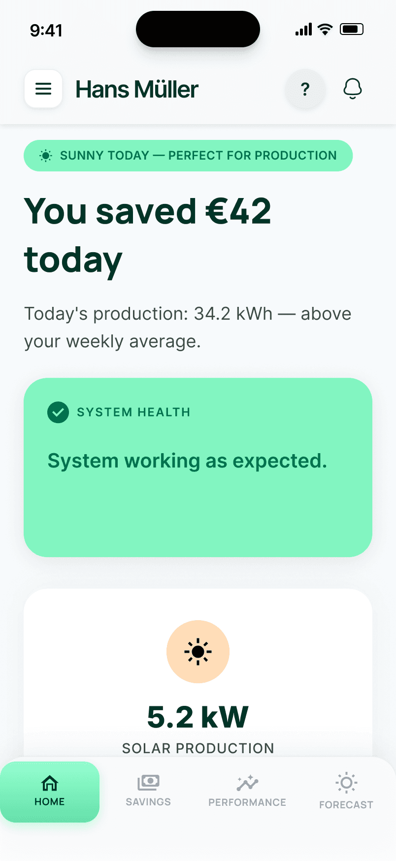
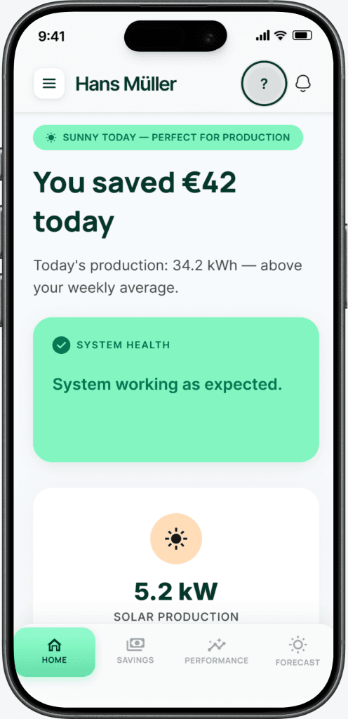
"You saved €42 today"
Euros first — the metric that matters
"Above your weekly average"
Instant context, no interpretation needed
"System working as expected"
Explicit reassurance removes anxiety
Based on patterns observed in App Store reviews. No access to the actual Enpal app codebase.
How might we
Restore user trust in an automated home energy system to enable confident energy and financial decisions?
04 · Scope
Hardware reliability and backend data accuracy are real problems — but they're not design problems. This concept focuses on what the app can control.
05 · Competitive gap
A comparison of four apps in the energy management space. All show production data. None connect it back to the original sales promise.
Smart energy + electricity provider
Solar PV subscription provider
Premium solar + battery ecosystem
Enpal: trust-first approach
★ = differentiating features not available in compared apps. Tesla offers monetary savings estimates (Solar Value / Energy Value) but does not compare against original sales forecasts or payback timelines. Analysis based on publicly available app descriptions and reviews.
06 · Solutions
Every design decision maps to a specific research finding. Expand “Design rationale” on any card to see the reasoning.

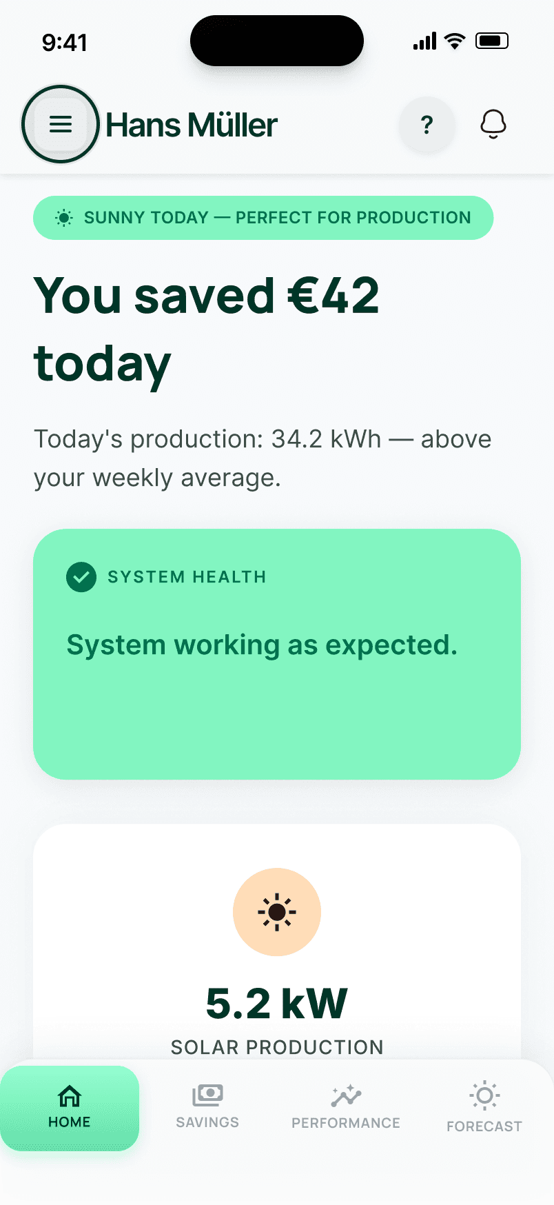
Production-first apps lead with solar production in kWh, a metric most homeowners can't intuitively translate into financial terms. The concept's Home screen opens with "You saved €42 today" as the primary statement, supported by a system health indicator ("System working as expected") and a plain-language energy flow summary. Technical metrics are present but secondary.
1Visibility of system statusUsers should always know what is happening at a glance. The original app required users to interpret kWh figures to understand system health, putting the cognitive work on them. The concept makes system status and financial outcome immediately visible without any interpretation required.
Key decisionSavings in euros as the hero metric, not production in kWh. Weather context (“Sunny today”) explains why today's numbers look the way they do — removing the anxiety of “is this normal?”

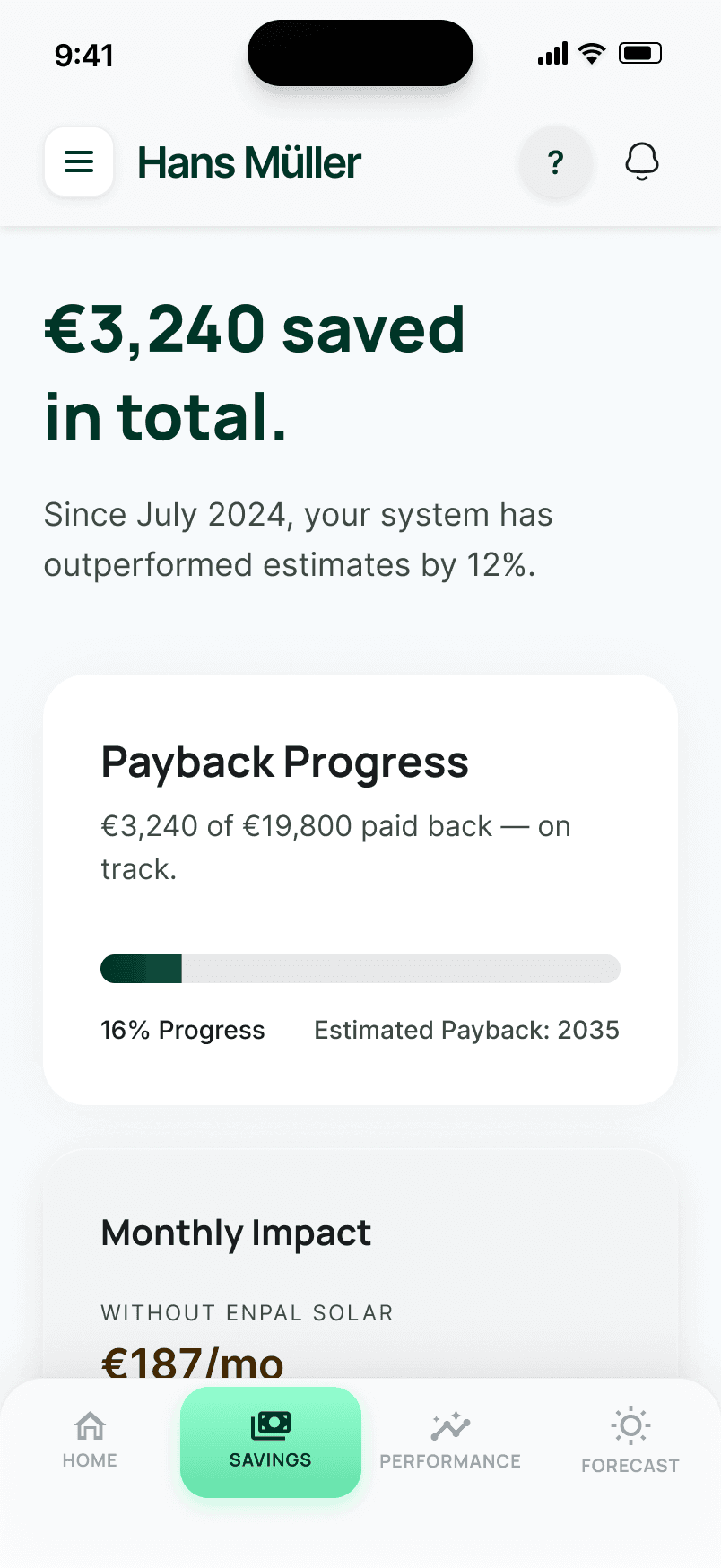
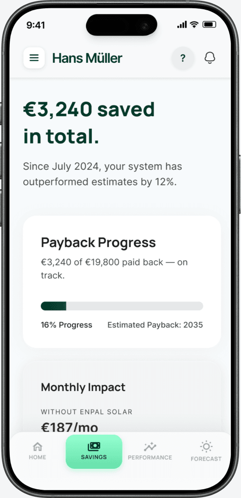
The savings screen directly answers the question every Enpal customer has but no current app answers: "Is my investment paying off as promised?" It shows total savings since installation, a payback progress bar (€3,240 of €19,800 paid back, on track), and a direct comparison: "Without solar: €187/mo. With solar: €31/mo." The sales forecast becomes a live benchmark, not a forgotten number from a brochure.
6Recognition over recallUsers shouldn't have to remember what they were promised at installation and compare it to what the app shows. The concept makes the comparison explicit and persistent — the original sales forecast becomes a benchmark the app tracks against automatically.
Key decisionThe payback progress bar is the most important element. It gives users a single, trackable answer to “was this worth it?” that doesn't require any calculation on their part.

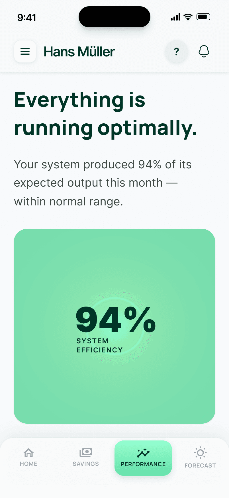
Instead of showing raw output figures, the performance screen opens with "Everything is running optimally" and a single efficiency score: 94% of expected output, within normal range. A 7-day actual vs expected bar chart shows the trend. Component status (panels, battery, grid) is shown with plain-language descriptions, not just green dots. The default state is explicitly reassuring — users aren't left to wonder if a number is good or bad.
4Consistency and standardsUsers shouldn't have to interpret what a number means — “94% efficiency” only tells them something if there's a consistent reference point. The concept establishes “expected output” as that reference, so every reading is automatically contextualised against the forecast the system was sold on.
Key decisionThe headline is always a verdict, not a metric. “Everything is running optimally” — not “94 kWh.” The number supports the verdict; the verdict doesn't require interpretation.


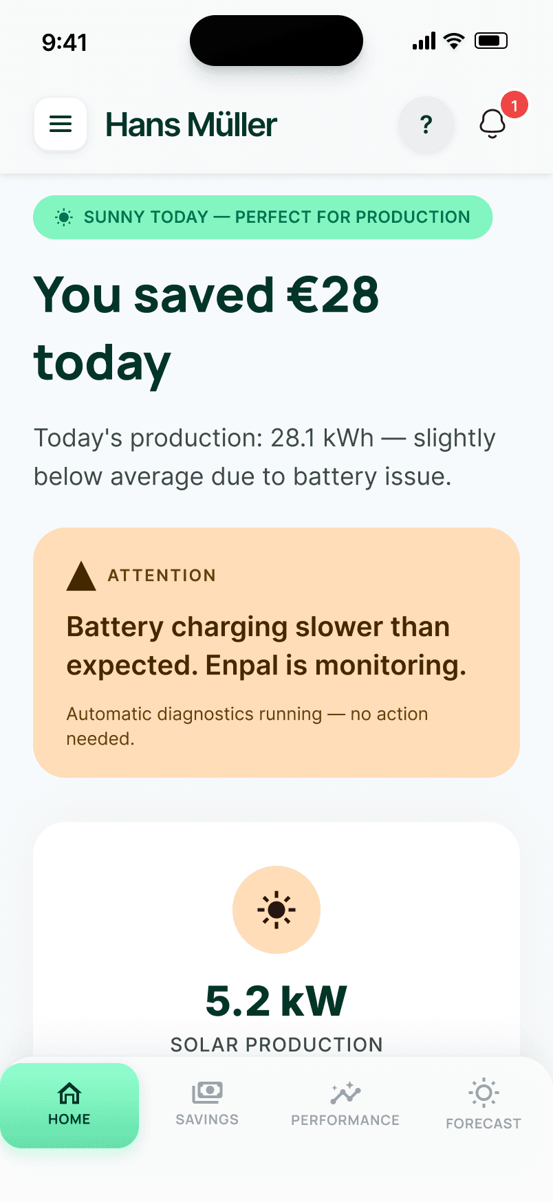
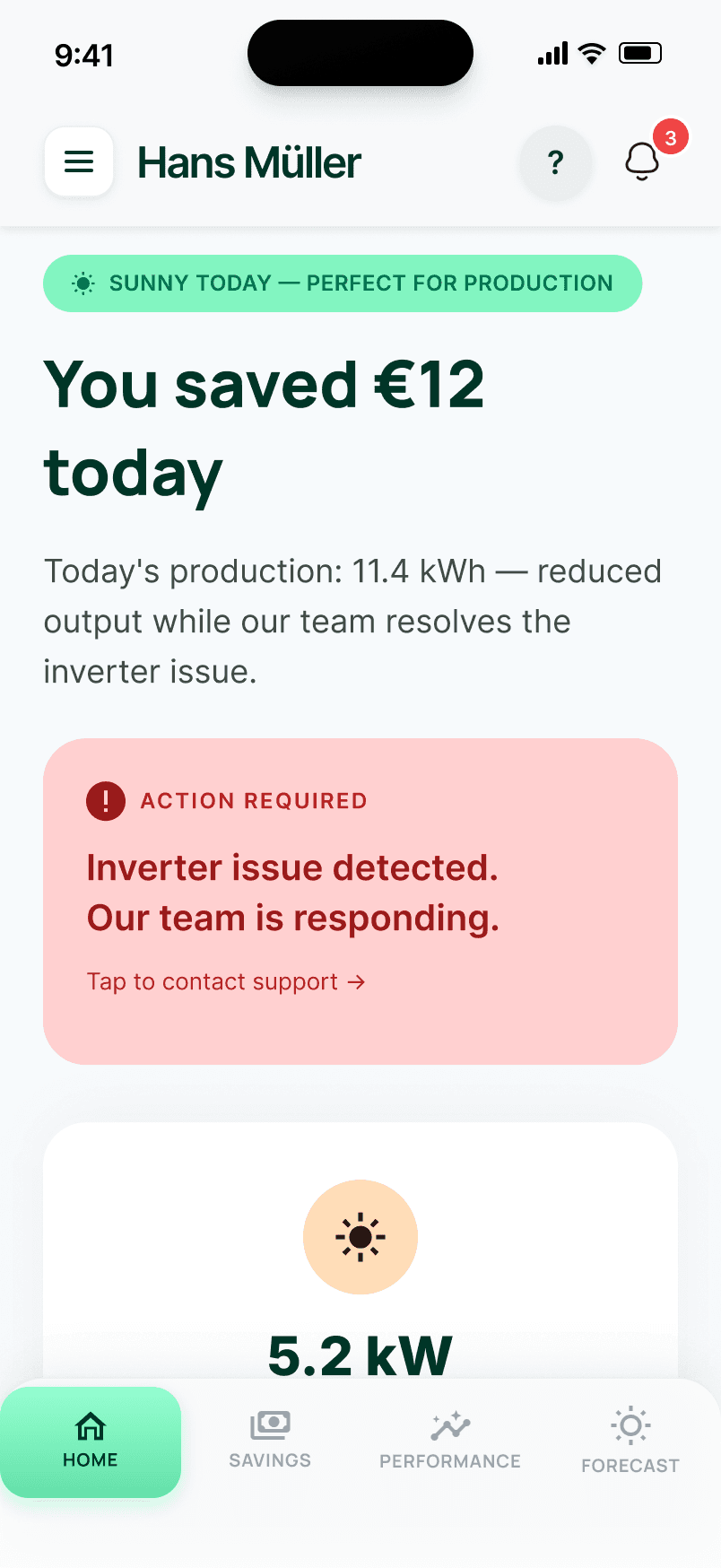
The System Health card uses a traffic-light model with three distinct states. Green: "System working as expected" with a checkmark — daily savings shown as €42. Amber: "Battery charging slower than expected. Enpal is monitoring." with a warning triangle — savings reduced to €28. Coral: "Inverter issue detected. Our team is responding. Tap to contact support." with an alert circle — savings reduced to €12. The dashboard layout stays identical across all three states; only the card colour, messaging, and savings figures change. This prevents layout shift and preserves spatial memory.
5Error preventionWhen errors occur, users need to know three things: what happened, whether it affects their savings, and whether they need to do anything. Each alert tier answers all three in one glance. Savings figures differentiate per state (€42 / €28 / €12) so users understand the financial impact of an issue — not just its existence.
Key decisionCoral (#ffd0d0) was chosen over alert red (#ff0000) for the critical state. Red feels alarming and erodes trust — precisely the opposite of what the app should do when a homeowner sees an alert on a system they paid €20k for. Coral communicates urgency without panic. And “No action is needed from you” on the amber state removes anxiety at exactly the moment it would otherwise spike.

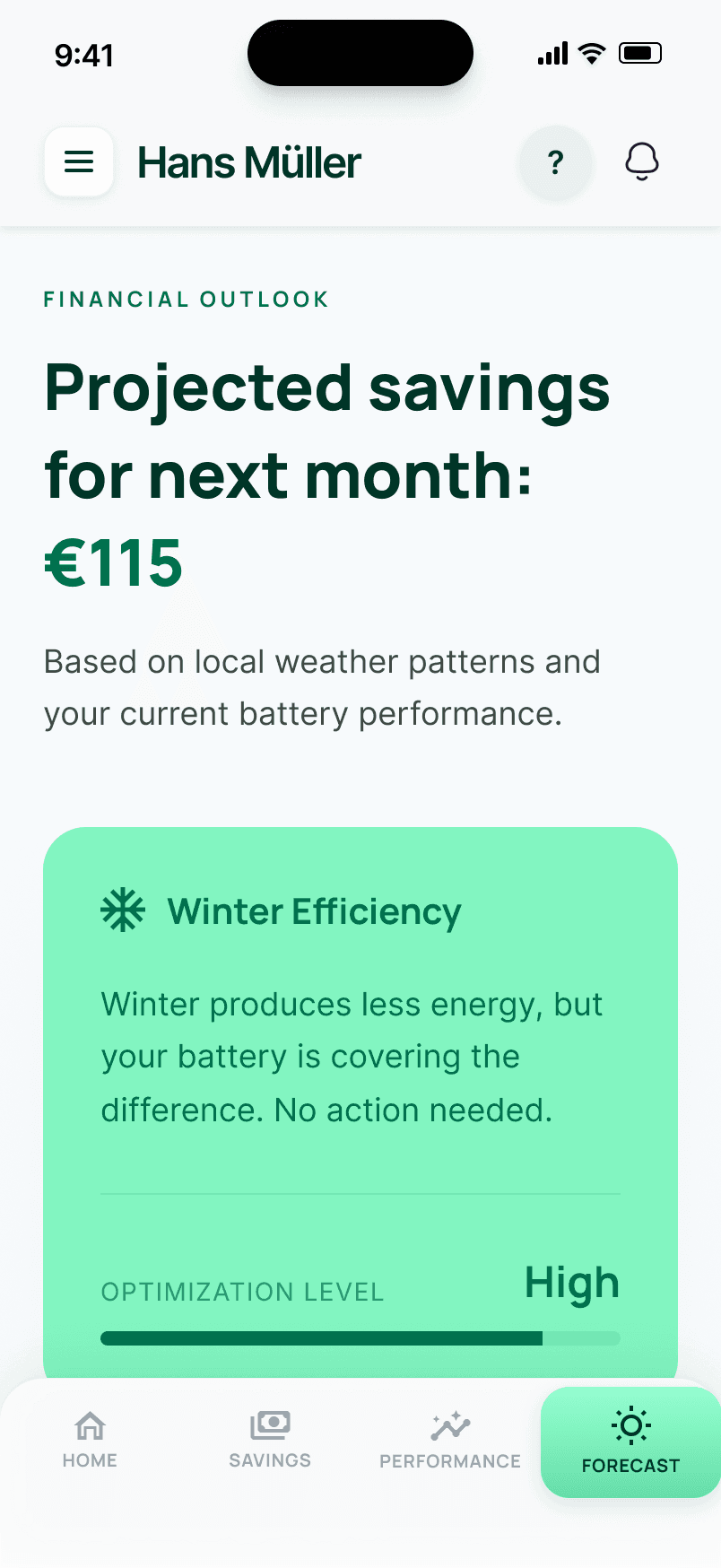
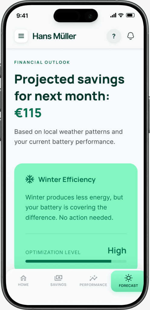
The Forecast screen projects next month's estimated savings (€115), contextualised with seasonal efficiency factors. Winter months naturally produce less solar energy — instead of letting users discover this through a confusing dip in their savings, the app explains it upfront. A CO₂ offset tracker adds environmental impact alongside financial data, giving users a second dimension of value from their system.
1Visibility of system statusForward-looking data reduces the anxiety gap between monthly bills. Users who can see projected savings don't need to wonder whether their system is underperforming during winter — the app tells them before they have to ask. This is visibility extended into the future, not just the present.
Key decisionPairing financial projection with CO₂ offset tracking. Users who aren't motivated by money alone can see their environmental impact — and users who are focused on ROI get a forward-looking number that keeps them engaged between bills.


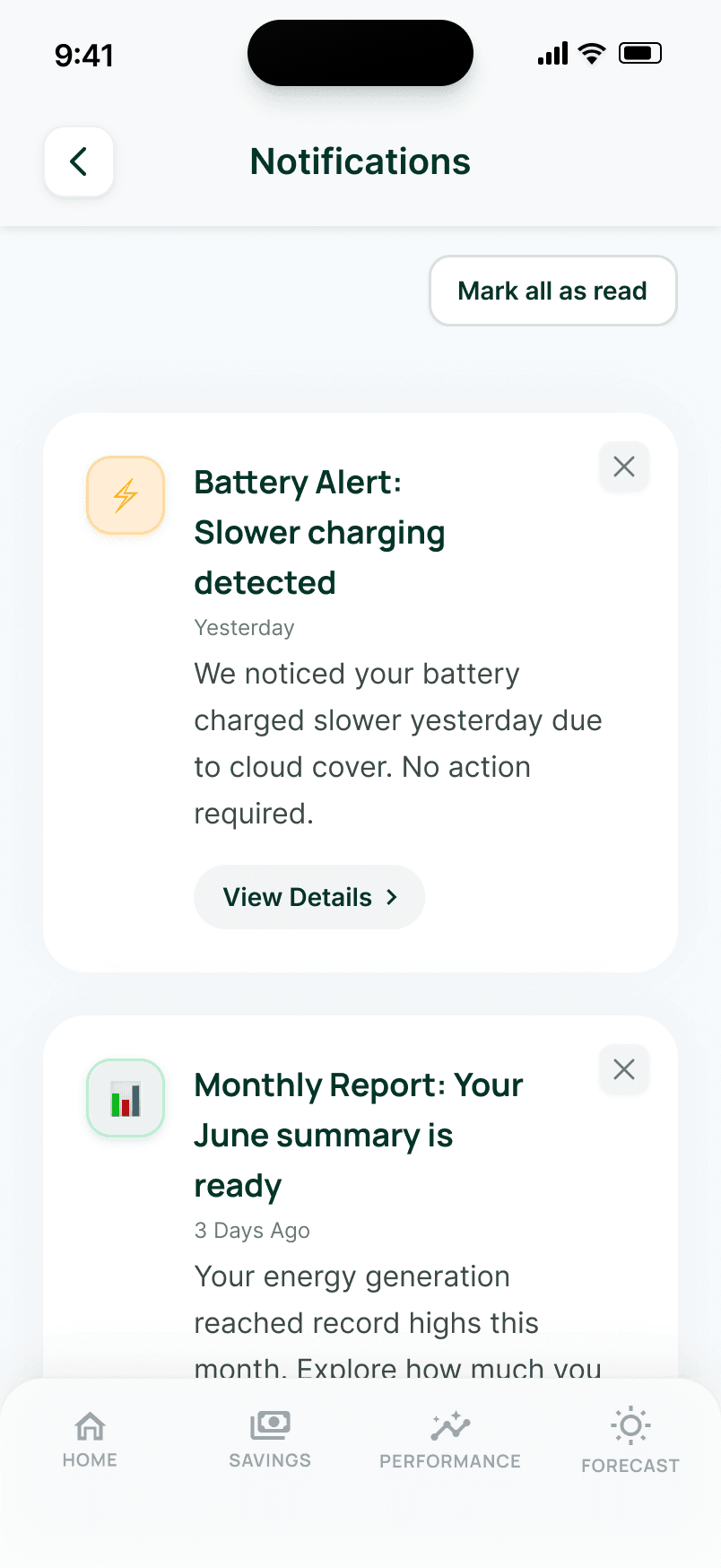
A bell icon with a count badge (1 or 3 depending on severity state) signals unread alerts. Notification cards use icon circle colours to communicate severity: amber for attention-needed items, green for positive confirmations. Users can dismiss individual notifications or tap "Mark all as read" to clear the list. The dismiss flow progresses naturally: 3 items, 2 items, 1 item, then an empty state reading "All caught up! No new notifications. Your system is running smoothly."
3User control and freedomUsers need to control what they've seen. The dismiss flow gives them agency over their notification list, while the system communicates proactively so users don't need to manually check for issues. The System Health card on the Home screen is tappable and navigates directly to Notifications.
Key decisionThe empty state is deliberately reassuring: “All caught up!” closes the loop. It tells users there's genuinely nothing to worry about — not that the system has stopped communicating. Severity is communicated through icon circle colour, not left border bars (which clipped against rounded corners while building the prototype).
07 · Design trade-offs
These are the choices that shaped the prototype, and the reasoning behind each one.


Same layout, same position, same components — only the colour, message, and savings figure change.
All figures shown are illustrative, used to demonstrate interface logic.
Red (#ff0000) feels alarming and erodes trust at exactly the moment the app needs to build it. Coral (#ffd0d0) communicates urgency without panic — critical for a user staring at an alert on a system they paid €20k for.
If the savings figure stayed at €42 during a critical alert, the user sees conflicting signals — the card says something is wrong, but the number says everything is fine. Differentiated figures make severity financially tangible.
The persona is 52 and moderately tech-comfortable. 2FA adds friction that outweighs its security benefit for this audience. Biometric login (FaceID/TouchID) was kept — it’s easy to operate. This is a deliberate simplification, not an oversight.
Left border bars were tried first while building the prototype but clipped against the card’s rounded corners, creating a visual artefact. Icon circle colours (amber for warnings, green for positive) communicate severity cleanly within the card’s existing shape.
Help was buried at the bottom of My Account, past four sections of settings. For a user who needs support, that’s four scrolls too many. The ? icon now appears on all six main screens, and Help & Support is also in the hamburger menu — two paths to the same destination.
Process note: The concept was evaluated against Nielsen Norman usability heuristics while building the prototype. These trade-offs emerged from that process — alongside fixes for navbar variant errors, jargon simplification, and visual consistency issues across alert and notification states.
08 · Interaction patterns
Both came from the persona. Hans is moderately tech-comfortable — explicit, labeled navigation works better for him than implicit shortcuts.


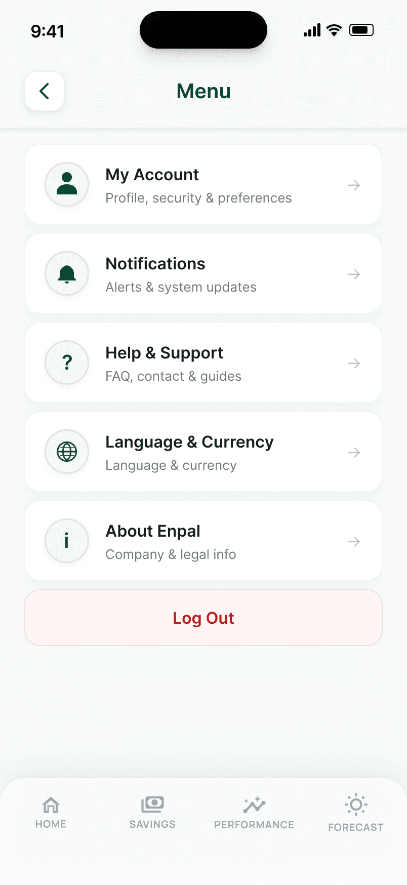
The profile photo was originally the only entry point to My Account — too implicit for older users. The hamburger menu provides explicit, labeled access to all six secondary features: My Account, Notifications, Help & Support, Language & Currency, About Enpal, and Log Out.
Both the hamburger menu and shortcut icons (? and bell) remain. The menu is a safety net. The icons are accelerators.


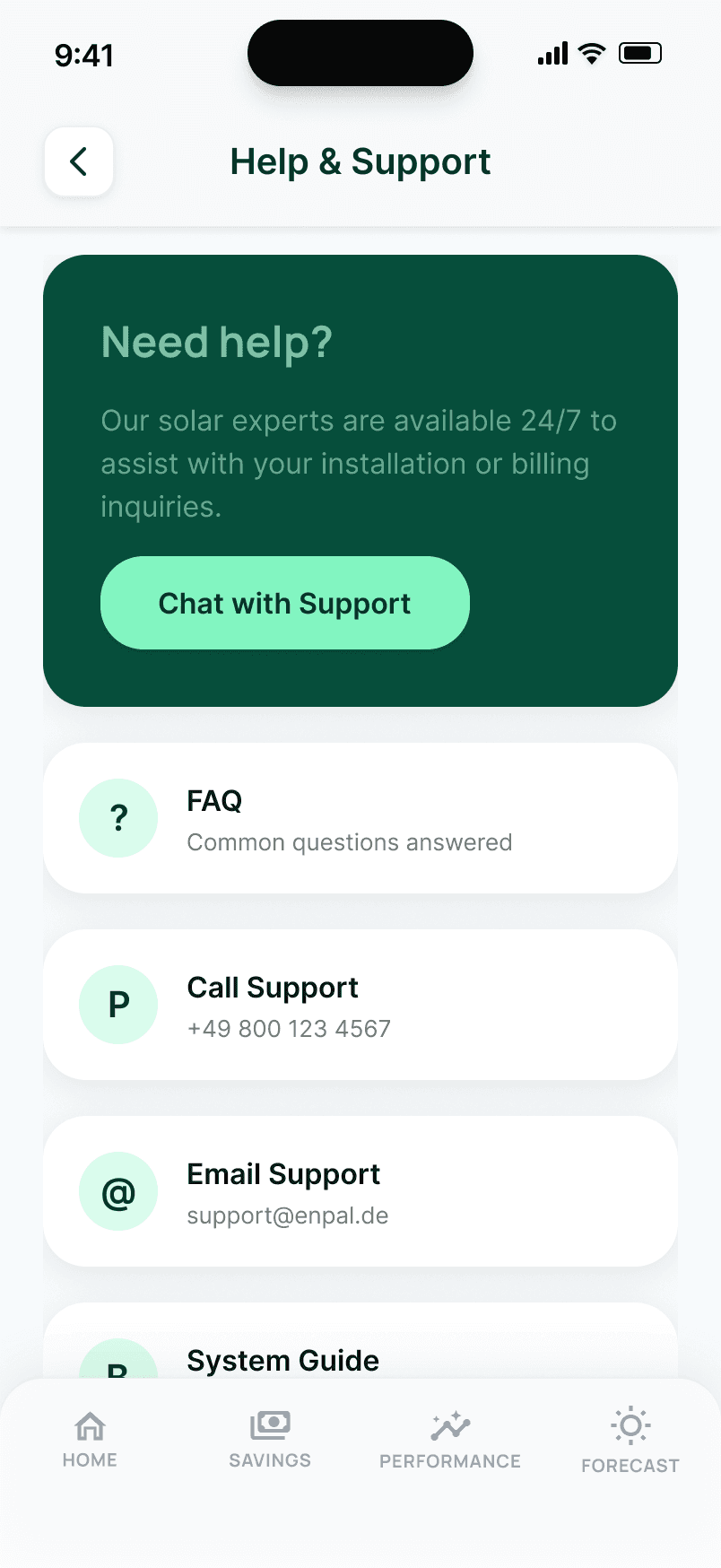
Help was originally buried at the bottom of Settings, requiring users to scroll past four sections to find it. It now has a dedicated Help & Support page accessible via a ? icon present on all six main screens and via the hamburger menu.
Four clear channels: Chat with Support (AI chatbot), Call Support, Email Support, and System Guide. Each CTA names the channel — no ambiguous wording.
09 · Multilingual support
Expanding across Europe means more than translated strings. Financial terminology, number formats, and currency conventions differ across markets — and getting them wrong creates an immediate trust barrier.
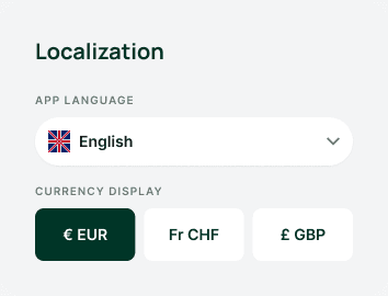
Enpal's expansion beyond Germany into France, Spain, Italy, and the UK requires the app to feel native in each market, not just translated. The Settings screen supports all five target languages alongside a currency display toggle (EUR, CHF, GBP), so financial data always appears in the format that feels natural to each user. German is the primary market; English supports UK expansion, French/Spanish/Italian unlock pan-European reach, and CHF support extends to Switzerland — whose three official languages (German, French, Italian) are already in the dropdown.
My Account · Settings sections


Localization is where the multilingual story actually lives — five language options plus EUR / CHF / GBP currency display, both inside the same My Account profile page.
Business case: Enpal's upsell model depends on trust. A British customer seeing EUR amounts when they expect GBP, or a French customer reading savings data in German, faces an immediate trust barrier before the content has even had a chance to reassure them. Language and currency support is trust infrastructure, not a UI addition.
10 · Reflection
Every problem in this project traced back to the same root cause: the app displayed what the system produced (kWh, feed-in data, efficiency figures) not what the customer actually bought. Money saved. Investment paying off. System working as promised.
Switching from kilowatts to euros wasn't cosmetic. It reframed what the app was for. And for a subscription model built on a promised financial outcome, that's not a UX detail. It's a retention lever.
Explore the full prototype
All 15 screens across 6 solutions, 3 alert states, and the full notification dismiss flow.