CRM Dashboard

Designing CRM Dashboard
Role
UX/UI Designer
Industry
IT
Duration
3 Months
Difficulty in Locating Nearby Bikes
Users struggle to locate bikes on a cluttered map, leading to prolonged search times and, at times, frustration that causes them to abandon the app.


Limited Control over Map View
The map lacks filtering options, making it difficult to view bikes within a specific range or display only parking and bonus stations.
Missing Info on Past Trips
Due to the lack of interactivity on maps for past trips, it's hard to locate a past trip's start and end locations. Information like distance travelled is also missing from the trip details.

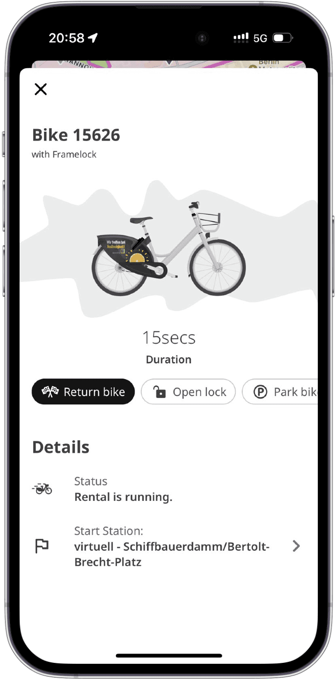
Incorrect Parking Location
While ending the trip at a parking location, there's no way to ensure we're parking at a designated area. If it's recognized to be parked outside the parking zone, a fine is charged for incorrect parking.
Solution
Below is a quick overview of the final solution highlighting the user challenges solved. A quick correlation between newly developed features and their impact on business KPIs.
Below is a quick overview of the final solution highlighting the user challenges solved. A quick correlation between newly developed features and their impact on business KPIs.
Clean Map
Below is a quick overview of the final solution highlighting the user challenges solved. A quick correlation between newly developed features and their impact on business KPIs.
When zooming out, the page still looks clean and untidy, as it shows only a limited number of bikes on the map.
Eva Elle
@evaelle
Thank you for building such an empowering tool, especially for designers! The site went from Figma to Framer in less than a week!
Guy Mccoy
@mccoy
Playing around with @framer while building a landing page for a side project. I’m terrible at animations, but they make it so easy!
Kayla Ray
@kayray
I’ve built pretty handy sites powered by Craft or WordPress in the past, but seeing @framer tackle CMS stuff so effortlessly is mind-boggling
Learnings

Embracing Design Constraints
Working within an existing design system was challenging but sparked more creativity. It pushed me to find intelligent, seamless UX solutions that fit into the application.
Strategic Thinking
I realized how important it is to consider the business impact in design early on. This clarifies the value of my work and will make it easier to get stakeholder support on such future proposals.

Prioritizing with the Impact/Effort Matrix
The Eisenhower matrix helped me focus on what matters—finding quick wins with minimal effort. It reminded me that not all changes have the same impact, so I must choose wisely.
Other projects

Enhancing Core Business KPIs Through UX Optimization
I redesigned the popular bike rental app, Nextbike, to address key pain points, streamline the rental process, and positively influence key business metrics like CSAT scores through improved user experience.

Internship project: social dining app design
Designing a mobile app to connect food enthusiasts through shared dining experiences, from concept to prototype.

Graduation project: collaborative learning app design
Revolutionizing the educational ecosystem with a mobile app designed to enhance interactive learning and peer collaboration.