B2B Sales Dashboard

Overview

Managing sales data can often be overwhelming, with multiple metrics, order statuses, and business KPIs competing for attention. My goal with this project was to take complex sales information and present it in a visually intuitive and easy-to-understand dashboard.

Challenges

Despite the availability of sales data, businesses face significant issues in leveraging it effectively:

Despite the availability of sales data, businesses face significant issues in leveraging it effectively:

Information Overload

• On average, 73% of sales teams report struggling with data fragmentation, leading to inefficient decision-making.

• Without structured reporting, companies waste up to 30% of their time manually compiling sales reports.

Information Overload

• On average, 73% of sales teams report struggling with data fragmentation, leading to inefficient decision-making.

• Without structured reporting, companies waste up to 30% of their time manually compiling sales reports.

Information Overload

• On average, 73% of sales teams report struggling with data fragmentation, leading to inefficient decision-making.

• Without structured reporting, companies waste up to 30% of their time manually compiling sales reports.

Difficult Navigation

• Sales teams often manage hundreds of orders daily, making it hard to locate key transactions quickly.

• Poorly structured dashboards result in a 40% reduction in actionable insights, according to industry reports.

Difficult Navigation

• Sales teams often manage hundreds of orders daily, making it hard to locate key transactions quickly.

• Poorly structured dashboards result in a 40% reduction in actionable insights, according to industry reports.

Lack of Data Hierarchy

Key metrics compete for attention, making it difficult to distinguish critical insights from less important data.

Poor UX in reporting tools leads to missed insights and slower responses to market trends.

Lack of Data Hierarchy

Key metrics compete for attention, making it difficult to distinguish critical insights from less important data.

Poor UX in reporting tools leads to missed insights and slower responses to market trends.

Design Approach

Organizing Information Hierarchically
  • Primary Data (KPIs)

  • Secondary Data (Garphs & Charts)

  • Detailated Information (Ordered List)

Using Visuals to Simplify Data
  • Graphical Representation

  • Color Coded section for better clarity

  • Visual cues to highlight order progress

Seamless user navigation
  • Left nav bar to acess different section easily

  • Filters to sort data quickly

  • Filters to sort data quickly

Results

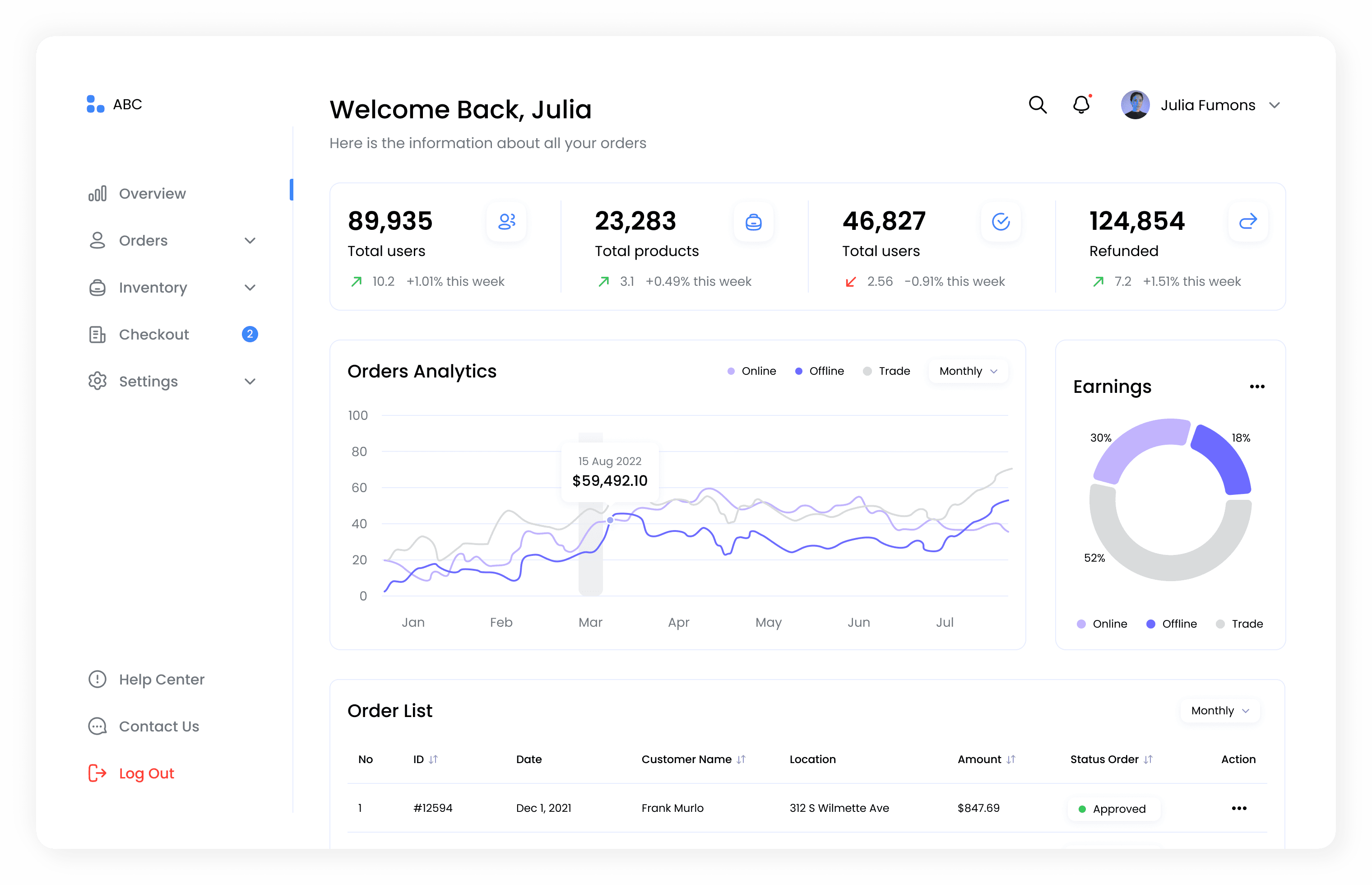
Dashboard: Displays key sales metrics, order analytics, and earnings breakdown

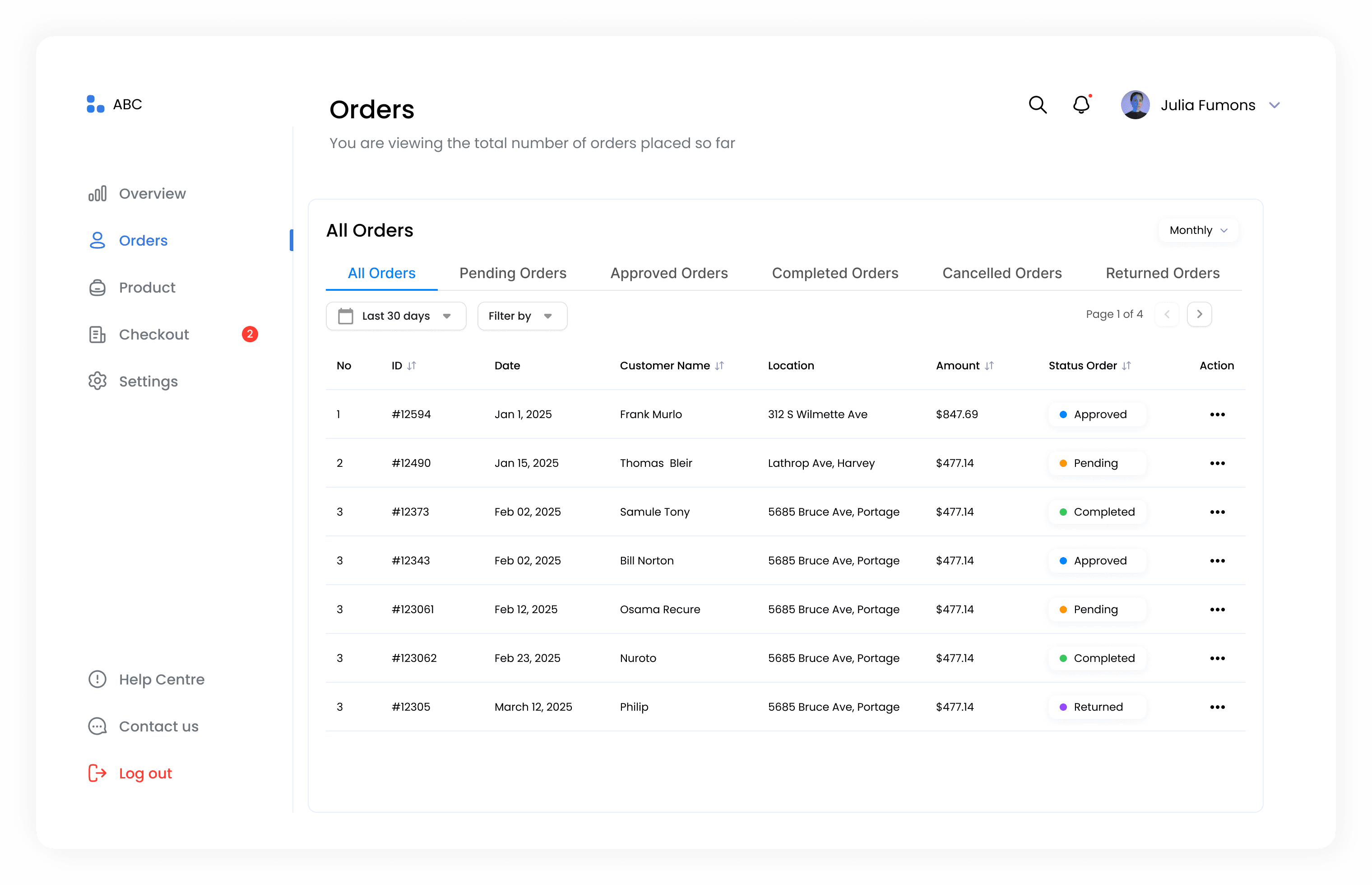
Orders Page: Provides a structured table for tracking and managing orders with status indicators.

Final Outcome

Simplified Insights

Clear, visual trends make sales data easy to understand at a glance.

Effortless Order Tracking

Track orders, monitor progress, and make decisions without the clutter.

Sanapati Chandrika

Copyright 2024 by Sanapati Chandrika

Sanapati Chandrika

Copyright 2024 by Sanapati Chandrika

Sanapati Chandrika

Copyright 2024 by Sanapati Chandrika